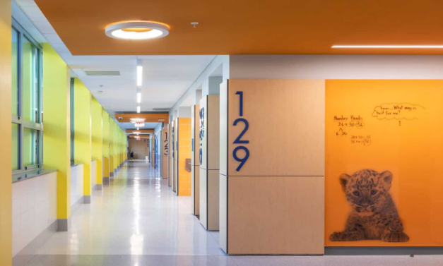
Have you ever walked into a store and felt an inexplicable urge to browse, or entered an office that instantly soothed your nerves? It’s not magic, it’s science! Color psychology, the study of how colors affect our moods and behaviors, plays a significant role in shaping our experience in commercial spaces.
Think about Your Favorite Restaurant.
Does it boast vibrant walls painted in fiery reds and energetic oranges? These warm tones are strategically chosen to create a lively and social atmosphere, subconsciously encouraging you to linger and perhaps indulge in an extra dessert. On the other hand, a calming spa might embrace cooler blues and tranquil greens. These colors promote feelings of serenity and trust, perfectly complementing the establishment’s focus on relaxation and well-being.
Color Goes Beyond Influencing Emotions.
It also impacts how we perceive space. Lighter shades like white and pastels can make a room feel airy and spacious, ideal for smaller shops where maximizing perceived square footage is crucial. Conversely, darker colors like navy or rich browns can create a sense of intimacy and sophistication, well-suited for high-end boutiques aiming to project an air of exclusivity.
However, color psychology is more nuanced than simply slapping on a coat of paint. It’s about crafting a cohesive color palette that seamlessly integrates with your brand identity. A playful daycare might incorporate bright yellows and greens to reflect its energetic and nurturing environment, while a sophisticated law firm would likely lean towards deep blues and grays to convey professionalism and trust.
Here’s a Quick Color Guide to Get You Started:
- Reds and Oranges: Stimulate energy and appetite, making them ideal for restaurants, fast-food chains, or fitness centers.
- Yellows: Uplifting and cheerful, perfect for cafes, children’s stores, or co-working spaces.
- Blues: Promote calmness, trust, and productivity, making them well-suited for office spaces, spas, or financial institutions.
- Greens: Evoke feelings of nature, growth, and balance, ideal for healthcare facilities, yoga studios, or garden centers.
Remember, color is just one element of the design equation. Consider incorporating lighting, textures, and furniture that complement your chosen palette. By harnessing the power of color psychology alongside these other design elements, you can create a commercial space that not only looks visually appealing but also subtly influences how customers feel, behave, and ultimately, interact with your brand.
This post was written by a professional at Fresh Painting. Whether it’s a residential internal or an external painting, Their team of expert painters and professionals at Fresh Painting FL in Jacksonville offers incredible service and an excellent finish at affordable prices. They specialize in residential painting and internal and exterior painting, and we pride ourselves in being reliable, honest, and hard-working.